


The Emperor’s New Clothes
Client: Raekwon / Mass Appeal
Role: Creative Direction, Visual Identity & Packaging Design
Overview
For the release of The Emperor’s New Clothes, Raekwon’s latest album, Mass Appeal tasked me with developing a visual identity that embodied confidence, legacy, and cultural weight. The design needed to merge Raekwon’s timeless Wu-Tang roots with a refined, regal energy, something that could feel at home on a museum wall yet still pulse with the grit of the streets.
Challenge
The album’s title “The Emperor’s New Clothes” provided a built-in narrative, but it had to be expressed visually without falling into cliché or overly literal depictions. We needed a single unifying design element that could serve as the campaign’s visual anchor across physical packaging, digital platforms and merchandise.

Creative Direction
The creative approach leaned into minimalism with intensity: a stark black-and-red palette, bold typographic treatments, and controlled negative space. The goal was to make each asset feel deliberate and unshakable, with the title lockup as the centerpiece of the campaign. The pure black typography against a vivid, blood-red field created tension and authority, a nod to imperial banners, classic cinema title cards, and hip-hop’s bold visual history.
Execution & Deliverables
-
Primary Title Lockup
-
Type Design
-
Product Design & Packaging: Vinyl jackets & CD digipak
-
Social Rollout: Teasers, cutdowns, graphics, title cards, etc.
-
Merch applications: T-shirt and posters
-
LED Promotion truck: Video content and design
-
Animated Apple Motion and Spotify Canvas
-
YouTube visualizers & more.


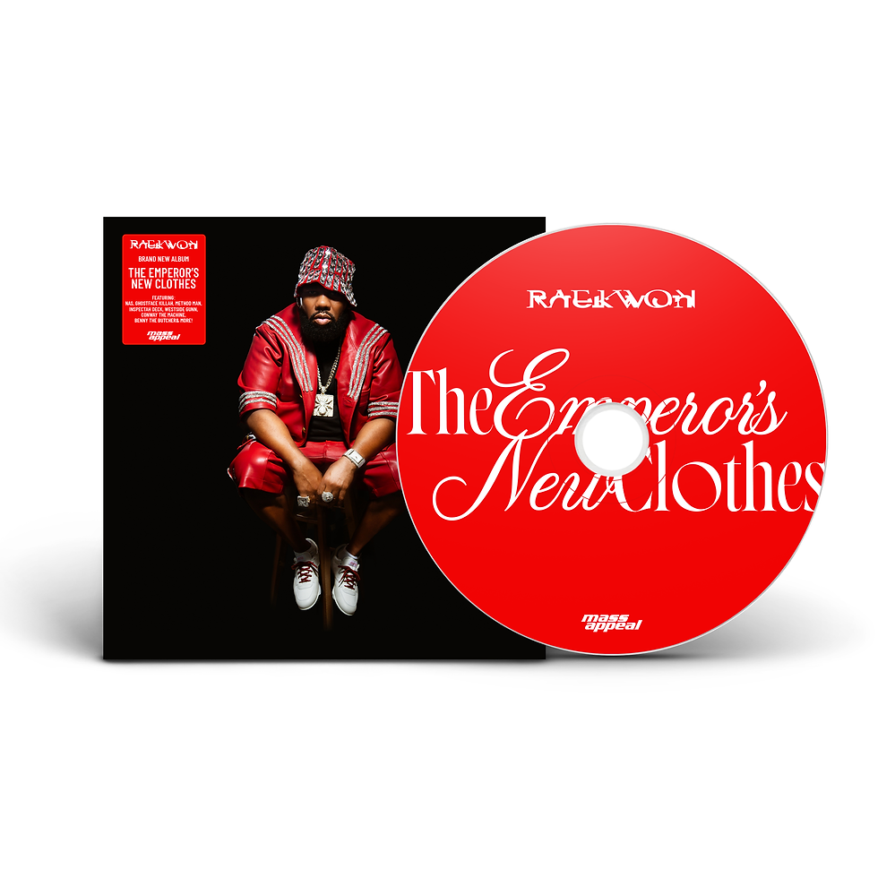


Title Lockup
The title lockup became the campaign’s crown jewel — a typographic performance in itself:
Typographic Hierarchy: "Emperor" and "New" were given dramatic visual weight through scale and flourish, making them the natural focal points and embodying the grandeur of the title.
Font Contrast: The pairing of elegant, high-contrast serif italics with sharper, more modern letterforms created a push-pull between refinement and power — mirroring Raekwon’s balance of sophistication and raw authenticity.
Symbolism: By visually amplifying “Emperor” and “New,” the lockup emphasized both the stature of Raekwon as a cultural figure and the sense of renewal/reinvention that comes with each release.


